As Mike notes, marking today as the day that the first draft of the Declaration of Independence was presented to Congress is largely a matter of interpoloation on the part of historians working from incomplete information. But who are we to argue?
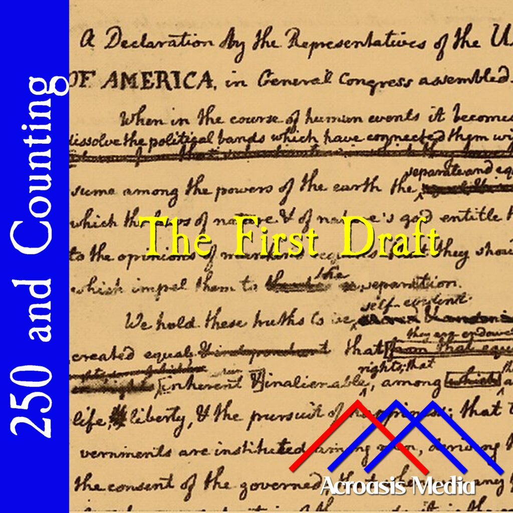
The writing you see in today’s cover art is, in fact, Thomas Jefferson’s, mostly. Some of it is corrections made by Benjamin Franklin. It’s also worth noting that this image came from Wikimedia Commons and is color-adjusted. The original image has the paper looking much whiter, but the parchment coloring makes for a little bit better contrast against the ink.
Incidentally, some documents from this era do look very good still while others are quite faded. The original Declaration of Independence, for example, is rather faded. This is because over time, the ink oxidized from black to a brownish color. In addition, it was displayed under relatively bright light for many years, and the ultraviolet radiation from those lights further faded the ink. The specific paper can also have an effect; some documents are written on a kind of cotton rag, which allows the ink to “bleed” over time and start to look rather smeared, whereas other documents written on vellum (which was basically calfskin) hold their shape better. In both cases the color holds better unless UV gets to it.
Oddly enough, paper from the 19th through mid-20th centuries made use of wood pulp, which turns color and becomes more brittle over time, and is more acidic, which will damage the ink as well. So it’s possible that there could be a “hole” in our historical records unless steps are taken to preserve, or at least digitize, some of them.
Podcast: Play in new window | Download | Embed
Leave a Reply